Watercolour pigments
By understanding pigments, you can understand what type of colours you have in your set. What characteristics do they have, and how can they impact your work. For example, how the colour reacts to sunlight and its durability. Pigment codes can also show if the shade you want to buy is possible to mix. Sometimes instead of buying different shades, some people like to use pure pigments (red, yellow, blue). However, it is acceptable to purchase the shades of colours instead of mixing them each time. Especially if you have your own style, and it includes often using certain shades.
So what to consider when looking at the pigments is, first of all, ignore the names of colours given by the manufacturer because each can provide different names to the colours. Instead, look at the codes; for example, “PY “stands for yellow pigment and Cadmium Yellow PY35. You can take a look at all of the stains here https://www.jacksonsart.com/blog/2021/09/17/pigment-colour-index-yellow-pigments/
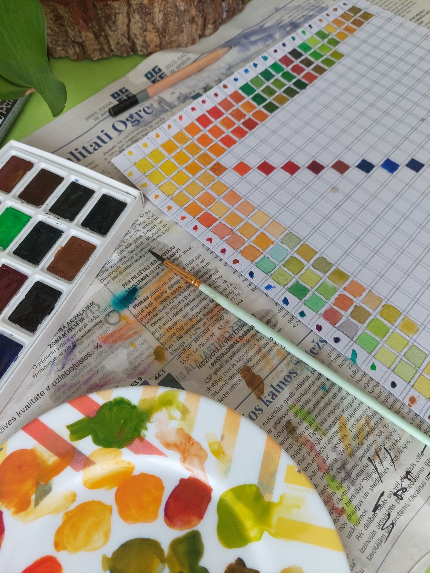
Tip: Creating your mix chart is useful when getting your first watercolour set.
Transparency
When applied to the paper, these watercolours let the most light through, resulting in bright, vibrant colours. With them, you can create smooth and delicate transitions. When watercolours are translucent, they produce a rich combination of colours that seamlessly blend, minimizing any negative impact from mixing.
On the other hand, opaque watercolours, such as those containing multiple pigments, are challenging to work with and demand skilful mixing and meticulous adjustment afterwards.
Beginners are encouraged to use single-pigment clear watercolours, which are easier to work with. Meanwhile, skilled painters may experiment with and improve their artistic expressions by exploring the possibilities of multi-pigment and granular paints.
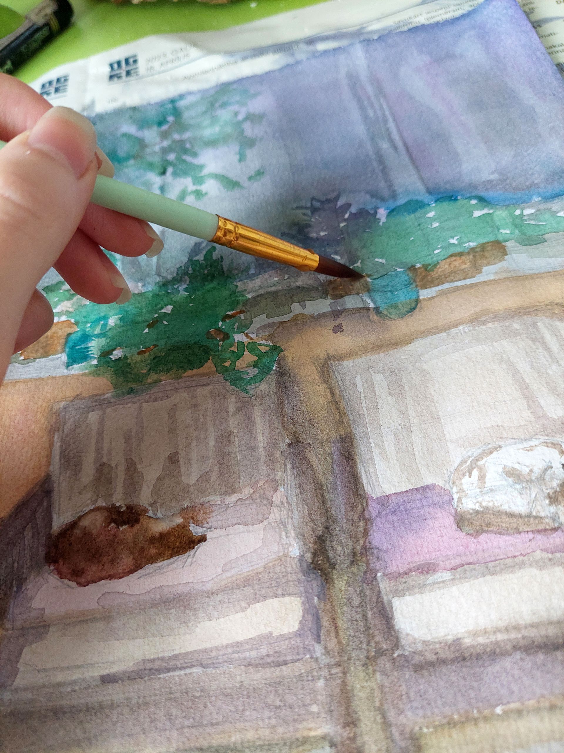
To test your watercolours’ transparency, you can create something similar to a mixing chart. This test will also show how the colours from your pallet interact with each other. Start by painting one long, tick, vertical line of one of the colours from your palette. Then let the colour dry completely, and afterwards, paint the remaining colours (horizontally) from your pallet on the top. Certain hues enable more of the underlying pigment to show through than others, exhibiting how different colours interact with one another.
Use all of the colours in your palette to complete this exercise. You may annotate the brushstrokes and save this page for future reference. Go back to it whenever you need to know what hue will result when two different colours are piled on each other.
Lightfastness
Lightfastness refers to how the pigments in your watercolours interact with light. This characteristic will determine the lifespan of your work and whether it will fade. When buying watercolours, consider lightfastness, indicated by “good” or “excellent” words or Roman numbering, according to the ASTM scale (the number I stands for over 100 years, II for up to 100 years, and III for 50-70 years of lightfastness, respectively).
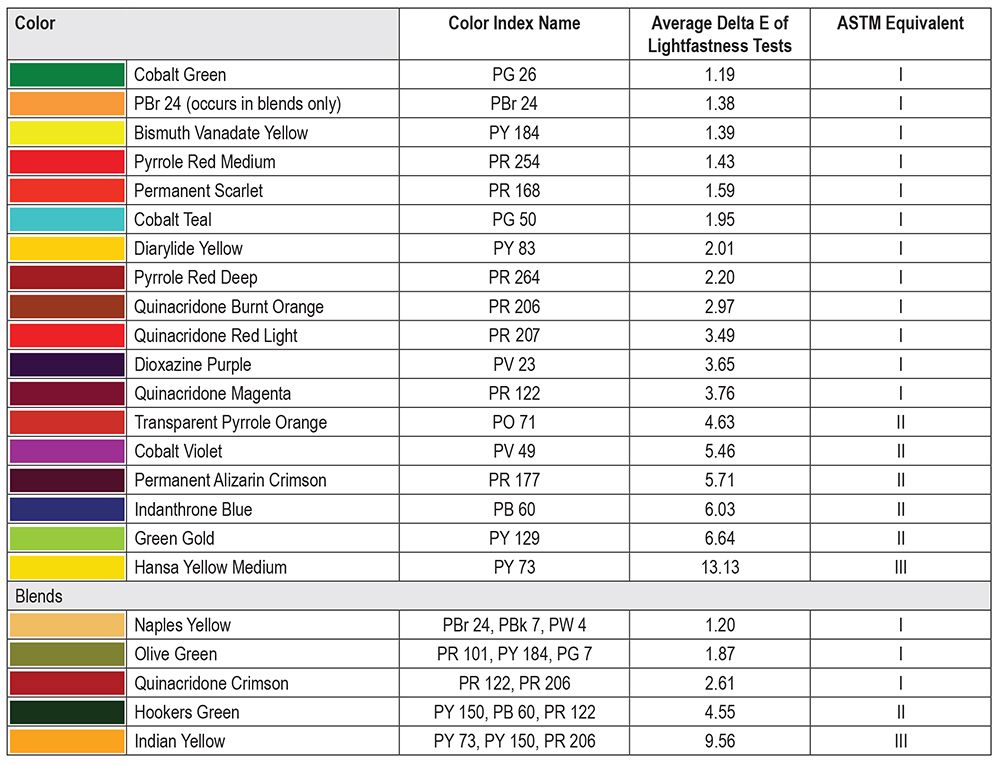
Image is taken from JUST PAINT (website), “QoR Lightfastness Testing Update” by
Sarah SandsPaint granularity
Granulated paint has the disadvantage of forming a textured look after drying due to the uneven distribution and poor quality of the colours. There are not a lot of ways to fix this problem. One way could be by buying more expensive colours. However, not everyone can afford to purchase professional watercolours. Therefore, don’t mix your colours too much if you notice that your colours are granulated. Instead of mixing colours, try layering them by applying one colour and then the other on the top when the first layer has gotten a bit dryer.
The letter G is frequently used on packaging to indicate the presence or possibility of paint granulation. The letters Y and N represent the presence or absence of granulation, respectively.
*All this information can usually be found on the product packaging or online by taking a look at a specific manufacturer.